


Article published: 8/4/21
Heuristics and UX
What’s the Big Deal?
When you browse the internet and go through different websites, some things may seem intuitive, like it just works the way you expect it to. Well, there’s a reason for that. That reason simply being that a lot of websites and the way they are designed are extremely similar.
From the way navigation bars and menus are laid out, to where the cart icon is, or even how information and photos are paid out on product pages, you may notice similarities across multiple sites you visit. This is a result of common best practices coming together for a unified approach on how ecommerce sites function and operate for users. Bringing forth an experience that essentially remains the same, no matter what website you go to.
So, what do we typically see?
- Cart, account and search on the right handside of the navigation bar.
- Product collections and categories in the center or towards the left, depending on where a website’s logo is located.
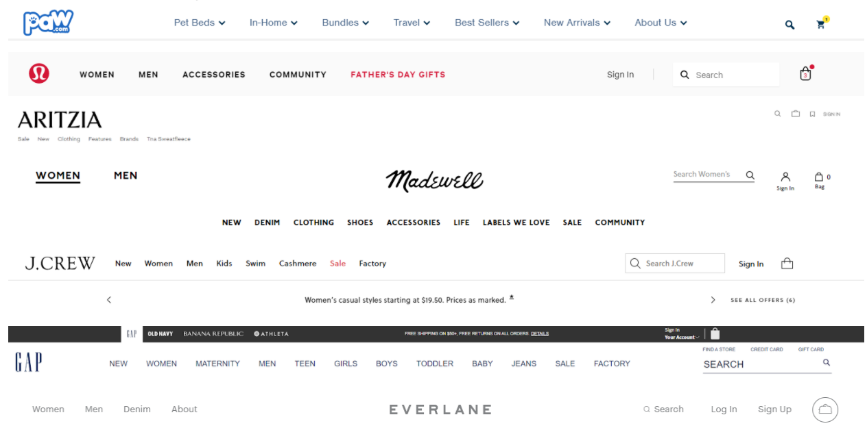
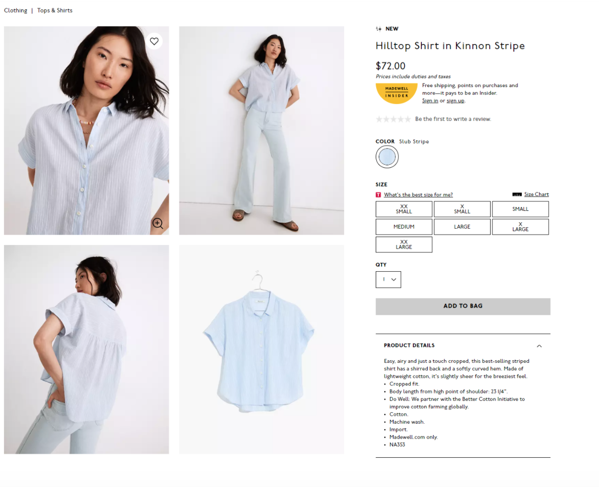
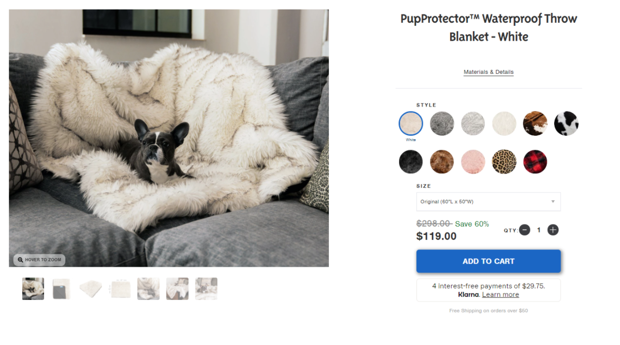
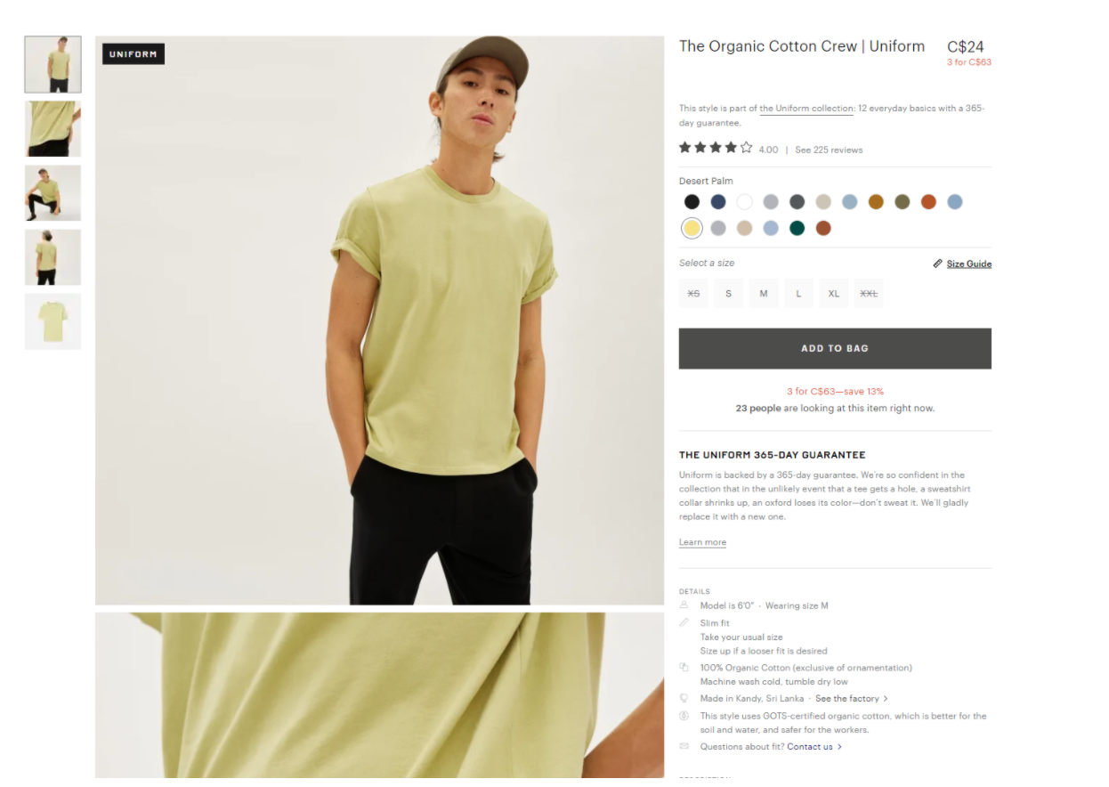
As you can see below there are 7 different websites, and yet navigation is pretty much all the same. The same can be said for product pages -- product gallery and images on the left side of the page, and product information on the right with size/variant options and the Add to Cart button. In the end, no matter what kind of ecommerce store you’re checking out, you'll likely get an extremely similar experience overall.
Is that a bad thing? No, not necessarily. What this means for the end user is that they won’t be confused when they’re on your website. They’ll know how to navigate, find the information they need about a product to add to cart, and most importantly, make a purchase. In recent years, as more and more stores began using Shopify as an ecommerce platform, something great for users happened. Checkout was the same everywhere they went! They knew exactly where to put their shipping and payment information everytime they came across a Shopify checkout page. One of the greatest causes of a potential customer abandoning their purchase at checkout is when the user gets confused on where they need to provide their information, and whether or not they trust the checkout process itself. With Shopify powering so many stores, its checkout experience has become ubiquitous, allowing users to feel comfortable with the checkout process.
So what do we do with these best practices, norms and heuristics? Simply put, we’ll use these best practices as a benchmark and see if a website follows these norms to provide a familiar experience to the user. It’s important to note that we’re saying it’s a familiar experience, not necessarily a good one.What these norms provide is a solid baseline for how well a user might be able to navigate through the website due to its familiarity. From there, what we can do to really see how users are interacting with your website is through observation of session recordings, heatmaps, and usability tests (which we’ll talk about in another post).
Best practices help lay a solid foundation for website layouts. However they might not always be the best user experience for people visiting your site. By using heat mapping and session recording software (such as Hotjar, Crazyegg, and plenty of Shopify apps) we’re able to truly see how users interact with your website and learn what’s being used, what isn’t, and get a glimpse into why people might be bouncing away from your website.
Heatmaps
At a glance heat maps are helpful. They provide information for you to see what kind of interactions are happening from your customers but they only tell you part of the story. Heatmaps tell you how far users may be scrolling down on your page or where they’re clicking, but they don’t tell you where the user came from before, where they went next, or what kind of bug or frustrations they may be experiencing on your site. That’s the role of session recordings and when you combine this information with insights from running polls and conducting surveys, you can have a much clearer picture of why a user might be leaving your website at a certain point in their journey or what kind of frustrations they’re experiencing on your website.Session Recordings
Watching session recordings can either be insightful, or a complete waste of time depending on how you go about it. Thousands of visitors are visiting your site each day, and you have plenty to choose from. You can choose to watch them at random, but in doing so, you generally will not find anything meaningful to analyze. We recommend pinpointing problem areas before you decide what sessions you want to watch, so you have specific patterns or issues to look out for.
Consider the scenario -- in your analytics you’ve seen that a lot of users are dropping off at the cart page after adding to cart, but you don’t know why. To tackle this problem, we’d first dig a little deeper into the data. Are the dropoffs happening for specific devices, browsers, or acquisition channels? Is there just an unusually large rate of abandonment at cart? Once you’ve pinpointed that there is an unusually large rate of abandonment, now it’s time to figure out what’s going on.
Many session recording tools will allow you to segment by device, pages that a visitor has gone to, what country or region they’re in, and even what browser or operating system they’re using. If within the analytics you know there’s an issue going on with a certain device, you can segment down to just watching these session recordings, and see what’s happening with these users to cause abnormally large rates of cart abandonment. In this case, it’s possible that a particular device and browser combination is experiencing a bug where the checkout button isn’t appearing, thus there is an abnormally high rate of abandonment.
Finding bugs isn’t the only way for session recordings to be used. You can also combine the information of what you see in heatmaps, polls, and surveys to see if there really is an issue of a user unable to find certain information they may be looking for on a product page or at cart, such as return & exchange policies. Once you’ve confirmed this information, you can apply it through usability tests and directly ask a user where they might have expected to see this missing information instead. Generally, we recommend watching at least 100 session recordings per device in order to fully establish that certain patterns are appearing.
Once you know what’s causing frustration for your users, you can start coming up with a plan on how to make your website easier and better to use because you now have an idea of why something isn’t quite working out. Now, you just need to figure out how to create a better experience, and that’s where A/B testing can come in handy.


